

Budgets get set from average ROAS. Every budget change, though, is a decision about the next dollar, and the next dollar rarely earns the average.
A saturation curve is the chart that shows the difference.
Most teams that have one still struggle to use it, though.
According to eMarketer, 87% of marketers familiar with marketing mix modeling call it important, yet 46% say slow processes keep them from acting on it. The curve sits in a deck while the budget moves on instinct.
This guide shows you how to read the curve, what each part of it means for spend, and how to turn it into a budget move you can defend to finance.
P.S. If you'd rather have a team read the curves and move the money with you, our media buying team plans spend on marginal returns every week.
TL;DR
- A saturation curve plots incremental revenue against spend for one channel.
- The slope at your current spend is the marginal ROAS, the return on the next dollar.
- Average ROAS can stay healthy long after marginal ROAS falls below breakeven.
- Trust the curve only within the spend range you've actually run.
- Move budget toward the channel with the steepest slope, then confirm the move with a lift test.
Our view: platform ROAS describes the past at the average, and a budget decision lives at the margin. We judge spend on incremental revenue and what it does to CAC, because a channel can look efficient in a dashboard while the last 20% of its budget buys almost nothing. So we treat every budget step as an experiment. Each step either confirms where the curve bends or moves the bend, and both outcomes make the next allocation smarter. The curve is a hypothesis about your spend, and paid media is where you test it.
What Is a Paid Media Saturation Curve?
A saturation curve shows how much incremental revenue one channel produces at each spend level, with every other channel held constant. You'll also see it called a response curve or a diminishing returns curve.
Models build it by changing spend and estimating what happens. Google's Meridian, for example, scales a channel's historical spend up and down and estimates the incremental outcome at each level, keeping the original timing of that spend intact.
The curve bends for practical reasons. The cheapest, most responsive audiences convert first. Frequency climbs as you spend more on the same people. Auction prices rise as you bid deeper into each audience.
Google's researchers built their media mix approach around exactly these two effects, lagged impact and diminishing returns, which linear regression struggles to capture.
Two numbers describe most curves.
- The half-saturation point is the spend level where the channel delivers half of its maximum response.
- The ceiling, or asymptote, is the most revenue the channel can produce at any spend.
How to Read a Saturation Curve in Four Steps
Read any saturation curve in the same order: the axes, your current position, the slope at that position, and the uncertainty around it.
- Check what each axis measures. The x-axis should show spend per week or per month for one channel. The y-axis should show incremental revenue, the revenue the channel caused, and not platform-attributed revenue. A curve built on platform ROAS inherits every attribution bias in the account, which is why business-level efficiency metrics make a better check on any channel number.
- Find the current spend marker. Most tools mark where you spend today. Meridian's response-curve plots show current spend so you can see where diminishing returns begin. Everything you read next is relative to that point.
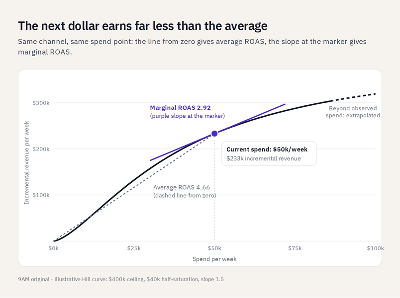
- Read the slope at that point against the line from zero. The slope of the curve at your marker is the marginal ROAS. A straight line from the origin to your marker is the average ROAS. Meridian's own example shows the gap: $10,000 spent, $25,000 incremental revenue, an ROI of 2.50, and an mROI of 0.80 for the channel near saturation.
- Check the uncertainty band and the observed spend range. The shaded band, or the dashed line beyond your highest historical spend, shows where the model is guessing. Meridian warns that extrapolation risk grows the further a point sits beyond historical spend. Read conclusions from the solid part of the curve.
How Average ROAS and Marginal ROAS Differ on the Same Curve
Average ROAS divides all revenue by all spend. Marginal ROAS measures what the next dollar returns. On a curve that bends, the two drift apart as spend grows, and the drift is where budgets leak.
The table below uses an illustrative channel modeled with a standard Hill curve: a ceiling of $400,000 incremental revenue per week, half-saturation at $40,000, and a slope of 1.5.
| Weekly spend | Incremental revenue | Average ROAS | Marginal ROAS |
|---|---|---|---|
| $10,000 | $44,400 | 4.44 | 5.93 |
| $30,000 | $157,500 | 5.25 | 4.77 |
| $50,000 | $233,200 | 4.66 | 2.92 |
| $80,000 | $295,500 | 3.69 | 1.45 |
At $10,000 a week, marginal ROAS sits above average, so the channel is still climbing. At $80,000, the dashboard reports 3.69, while the next dollar returns 1.45.
Whether 1.45 is good depends on your margin.
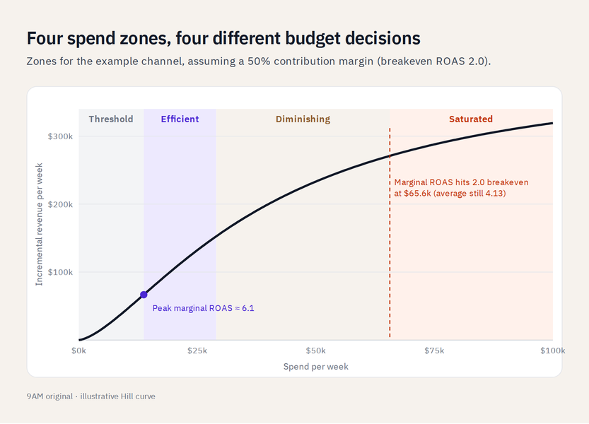
With a 50% contribution margin, breakeven ROAS is 2.0, and this channel crosses it at about $65,600 a week, where average ROAS still reads 4.13. Every dollar above that point loses money on the margin, even though reporting shows a strong channel.
Set your own breakeven from contribution margin for paid media before you read any curve.
The Four Spend Zones on a Response Curve
Every response curve splits into four zones, and each one calls for a different budget decision. Find your current spend marker, then match it to the zone below.
Threshold Zone: Spend Below the Inflection Point
In the threshold zone, marginal ROAS is above average ROAS and still rising. This only happens on S-shaped curves, where a channel needs enough spend to build frequency before it works. Spend here is too thin to do its job. Step it up, or consolidate scattered campaigns into fewer, better-funded ones.
Efficient Zone: Marginal Return Near Its Peak
The efficient zone holds the steepest part of the curve. In the example channel, marginal ROAS peaks around $13,700 a week at about 6.1. Scale here first, since each added dollar returns the most it ever will.
Diminishing Zone: Each Dollar Returns Less
In the diminishing zone, marginal ROAS falls with each step but stays above breakeven. This is where most growing accounts live. Keep scaling, but with guardrail metrics for scaling that stop spend before CAC drifts past your target.
Saturated Zone: Marginal Return Below Breakeven
The saturated zone starts where marginal ROAS drops under breakeven, near the flat top of the curve. The saturation point is the spend level where that happens. Hold spend here, or move the excess to a channel that still has headroom.
Curve shape decides which zones a channel has.
Meta's Robyn uses a Hill function that can produce S-shaped or C-shaped curves: a larger alpha makes the curve more S-shaped, and a larger gamma moves the inflection point later. C-shaped channels, such as branded search, have no threshold zone at all. Their first dollars are their best ones.
What Changes the Shape of a Saturation Curve
A saturation curve describes one period with one set of conditions. When the conditions change, the curve moves, so read it as a snapshot.
Creative Refresh Raises the Ceiling
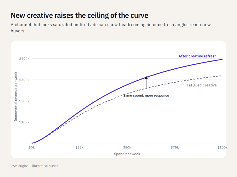
New creative reaches people the old ads never moved, which lifts the curve's ceiling. Fatigue does the opposite: as frequency rises on worn ads, the curve flattens earlier. Many "saturated" channels are really fatigued channels, a pattern that shows up as the brand tax of scaling paid without creative.
Audience Size and Market Demand Set the Asymptote
The ceiling reflects how many reachable buyers exist and how much demand they have. Expanding into new geographies, new audiences, or a new product line raises it. Seasonality raises and lowers it every year.
Carryover Spreads the Response Across Weeks
Ads keep working after they run. Models handle this with adstock, which spreads each week's spend across the following weeks. A curve read over a short window understates channels with long carryover, such as video and CTV, because part of their response lands outside the window.
Rising Media Costs Pull the Curve Down
Meridian's response curves assume a constant cost per media unit at the historical average. When CPMs rise, each dollar buys fewer impressions, so the real curve sits below the modeled one. Re-read the curve after any sharp cost change.
How to Estimate Saturation Without an MMM
You can approximate a saturation curve from your own spend changes, as long as each change runs long enough to read.
Start with spend step tests.
- Raise a channel's budget by 20%.
- Hold it for two weeks.
- Then raise it by another 20% and hold again.
- Compare the incremental revenue each step added against the step before.
Next, bucket past weeks by spend level and plot the marginal CPA of each bucket. A marginal CPA that climbs much faster than average CPA is the platform-data version of a bending curve.
For the cleanest read, run a geo test at two spend levels. Holding one region at current spend and pushing another higher shows the incremental response of the extra budget directly; this is the same design used in geo-lift testing.
| Signal | What it suggests | How to confirm |
|---|---|---|
| Marginal CPA rising much faster than average CPA | The channel is in its diminishing zone | Step test at +20% for two weeks |
| Frequency climbing while reach stays flat | You're buying the same people again | Check reach curves by audience |
| CPM up while conversion rate holds | Costs, not demand, are bending the curve | Compare cost per impression trend |
| Blended revenue up under 10% after a 30% spend increase | Spend is past the efficient zone | Geo test at two spend levels |
| New creative recovers efficiency | Fatigue, not saturation, flattened the curve | Hold spend flat and rotate creative |
How to Turn a Saturation Curve Into a Budget Decision
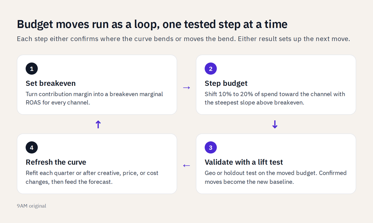
A curve becomes a budget decision when you compare marginal returns across channels and move money in tested steps. Run it in five steps.
- Set the breakeven marginal ROAS. Use the contribution-margin breakeven from earlier. Any channel whose marginal ROAS sits below it is losing money on its last dollars.
- Rank channels by marginal return at current spend. Robyn's budget allocator uses each channel's curve to find the spend mix that maximizes total response. Channels with headroom, meaning room to add spend above breakeven, go to the top.
- Move budget in steps toward the steepest slope. Shift 10% to 20% at a time, never the whole recommendation at once. Google's researchers found that a model's optimal media mix carries large variance because its parameter estimates do, so treat each recommendation as a hypothesis.
- Validate each move with a lift test. The IAB's 2025 guidance on modernizing MMM recommends pairing models with experiments and attribution, and Meridian now runs geo experiments to calibrate the model. A move the test confirms becomes the new baseline.
- Refresh the curve each quarter. New spend levels, new creative, and new costs all reshape it. Feed the refreshed curves into your paid media revenue forecast so finance sees the same numbers you plan from.
You might think that the hard part is the math. It's, in fact, the loop: setting breakeven, stepping budget, testing, and refreshing on a cadence the team actually keeps.
In practice that means:
- One owner for the curve
- A fixed review day each month
- A rule for how large a budget step can be before it needs a test
Without those three, the curve gets admired in a quarterly review and ignored in the weekly budget call.
The eMarketer data above found slow processes block more teams than missing models do, which is why the measurement setup matters as much as the model. Our analytics team builds that loop, from incrementality tests to the dashboards that show marginal returns next to the averages.
Common Misreads of a Saturation Curve
Four misreads cause most bad budget calls. Each has a simple check.
Treating the Flat End as a Hard Ceiling
A flat curve top often reflects stale creative, narrow targeting, or a short measurement window. Before cutting, rotate creative and widen the audience, then re-read the curve. If the top stays flat after both changes, you've found a real ceiling.
Reading Platform-Attributed Curves as Incremental
Some tools fit curves to platform-reported conversions. Those curves show what the platform claims, which includes sales that would have happened anyway. Run an attribution model audit before trusting any curve built on attributed data.
Trusting the Curve Beyond Observed Spend
The model has no data past your highest historical spend, so the curve out there is extrapolation. Treat it as a direction, and step into that range with a test.
Ignoring the Uncertainty Band
Two channels can share a point estimate and carry very different risk. A wide band means the model is unsure, so give that channel smaller budget steps and a faster test.
Plan Spend on the Margin with 9AM
Reading a saturation curve comes down to one habit: judging every budget change on what the next dollar returns. Find your spend marker, compare the slope against breakeven, stay inside the observed range, and confirm each move with a test.
9AM runs that loop with brands every week.
Our media buyers and analysts read each channel's curve, step budget toward the steepest slopes, and validate the moves with incrementality tests before they become the new plan. The result is a budget that grows where the margin supports it and holds where it doesn't.
Book a strategy call and we'll show you where each of your channels sits on its curve.
FAQs
Does a saturated channel mean you should cut its budget?
Usually it means moving budget, not cutting it. Shift spend above breakeven to a channel with headroom, and keep the saturated channel at the level where its marginal ROAS still clears breakeven.
How often should saturation curves be refreshed?
Refresh them every quarter, and after any major change in creative, pricing, seasonality, or media costs. A curve older than its conditions describes a market you're no longer buying in.
Do Advantage+ and Performance Max change how saturation behaves?
Automated campaigns spread spend across more placements and audiences, which can push the flat part of the curve further out. They don't remove saturation, so read curves at the campaign level and watch marginal CPA as budgets grow.
Can one channel's saturation curve shift when another channel scales?
Yes. Each curve assumes the other channels stay where they were, so scaling one channel can change how another responds. Re-read the curves for related channels after any large reallocation.